The Bureau website is a modern reimagining of the Australian weather and forecasting experience, driven by human intent and supported by intuitive and functional interactions.
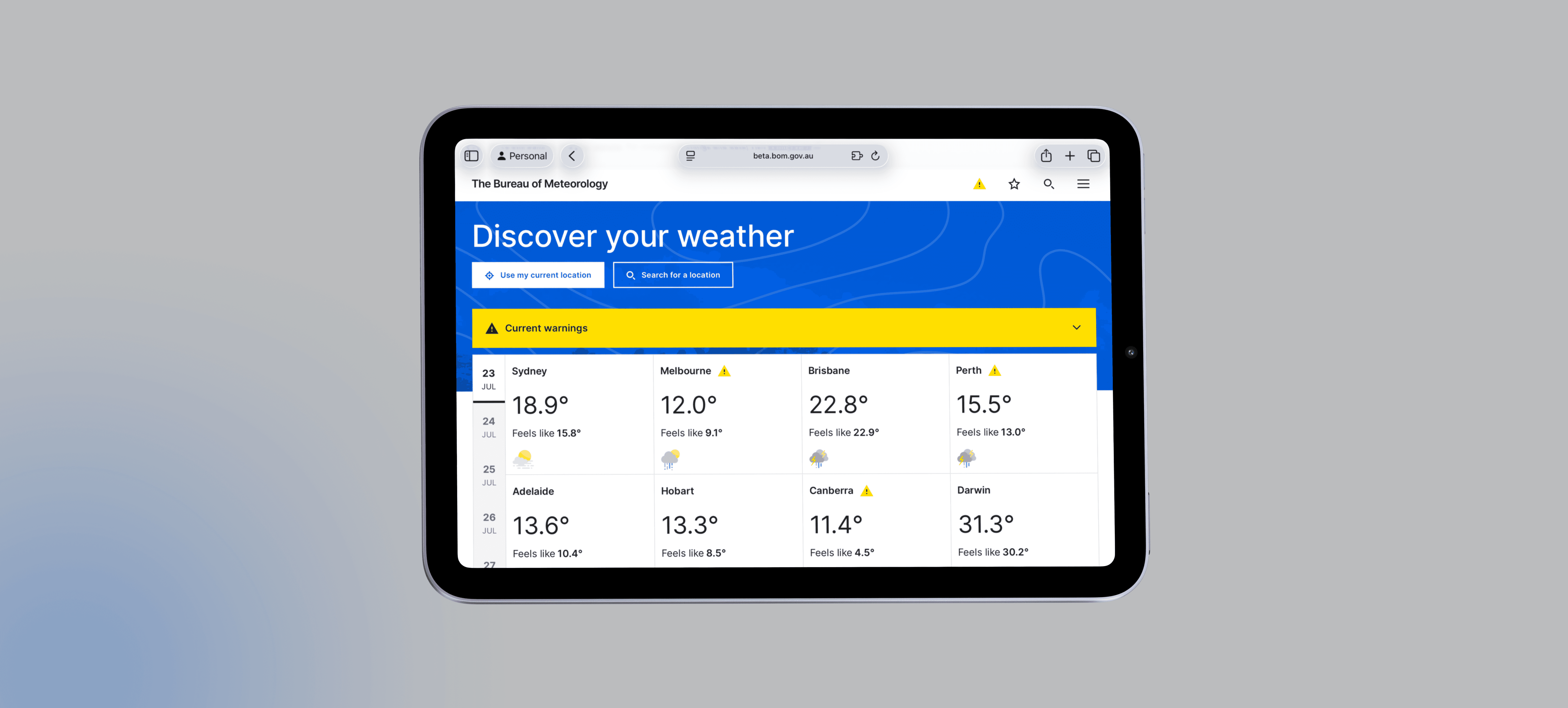
Reimagining Australian weather forecasting
The Bureau website is a modern reimagining of the Australian weather and forecasting experience, driven by human intent and supported by intuitive and functional interactions.
PROBLEM
Complexity compunded
The Bureau's platforms, though widely used, struggled with outdated design, navigation complexity, and accessibility issues. Users often faced difficulties accessing critical information quickly. The challenge was to address these issues while maintaining the trust and reliability users expected. Existing and new research conducted revealed four primary challenges with the existing site:
Goals
We converted our key problems into opportunities to solve for during the re-design:
Complex to simple
Ensure that our expertise in weather forecasts and alerts can be easily accessed and is channel agnostic.
Dated to modern
Align the website with contemporary design trends, making it visually engaging and easy to navigate.
Messy to consistent
Create a consistent user experience throughout the website, reducing confusion and increasing usability.
Exclusive to inclusive
Implement inclusive design principles to ensure the site is accessible to all users.
Complex
Users struggled to find localised weather data quickly, due to a cluttered user interface, IA, and navigation design.
Outdated
The interface didn't align with modern design standards or expectations.
Inconsistent
Discrepancies between the website and app created confusion.
Inaccessible
Users struggled to find localised weather data quickly, due to a cluttered user interface, IA, and navigation design.
RESEARCH
Research & Discovery
The redesign was driven by thorough research, incorporating key design and performance metrics, behavioral data, and insights from both internal employees and external customers. Early in the discovery phase, it became clear that a complete website uplift was needed, using modern design practices and informed by recent community consultations. These consultations, conducted in collaboration with community leaders from under-served areas and extensive interviews with CALD individuals, provided valuable insights. This research shaped the design direction, ensuring the redesign aligned with both business objectives and user expectations.
OPPORTUNITY
How might we make The Bureau of Meteorology
Modern
Accessible
Intuitive

YEAR
2023
ROLE
UX Designer
UI Designer
Design Researcher
SERVICES
UI Animation
Type Designer
About the project
Goal
For this Widgets, I've used two great fonts: Roboto and NDOT 47 and 45 (Inspired by Nothing). Yoy may find a folder for these font and others. To download and install this font for use within Figma, Once installed, restart Figma! Project by: kawsar.design
Smooth Scroll
This will hide itself!
This will hide itself!
Reimagining Australian weather forecasting
The Bureau website is a modern reimagining of the Australian weather and forecasting experience, driven by human intent and supported by intuitive and functional interactions.
PROBLEM
Complexity compunded
The Bureau's platforms, though widely used, struggled with outdated design, navigation complexity, and accessibility issues. Users often faced difficulties accessing critical information quickly. The challenge was to address these issues while maintaining the trust and reliability users expected. Existing and new research conducted revealed four primary challenges with the existing site:
Goals
We converted our key problems into opportunities to solve for during the re-design:
Complex to simple
Ensure that our expertise in weather forecasts and alerts can be easily accessed and is channel agnostic.
Dated to modern
Align the website with contemporary design trends, making it visually engaging and easy to navigate.
Messy to consistent
Create a consistent user experience throughout the website, reducing confusion and increasing usability.
Exclusive to inclusive
Implement inclusive design principles to ensure the site is accessible to all users.
Complex
Users struggled to find localised weather data quickly, due to a cluttered user interface, IA, and navigation design.
Outdated
The interface didn't align with modern design standards or expectations.
Inconsistent
Discrepancies between the website and app created confusion.
Inaccessible
Users struggled to find localised weather data quickly, due to a cluttered user interface, IA, and navigation design.
RESEARCH
Research & Discovery
The redesign was driven by thorough research, incorporating key design and performance metrics, behavioral data, and insights from both internal employees and external customers. Early in the discovery phase, it became clear that a complete website uplift was needed, using modern design practices and informed by recent community consultations. These consultations, conducted in collaboration with community leaders from under-served areas and extensive interviews with CALD individuals, provided valuable insights. This research shaped the design direction, ensuring the redesign aligned with both business objectives and user expectations.
OPPORTUNITY
How might we make The Bureau of Meteorology
Modern
Accessible
Intuitive
The Bureau Website & App
OVERVIEW
The Bureau website is a modern reimagining of the Australian weather and forecasting experience, driven by human intent and supported by intuitive and functional interactions.
YEAR
2023
ROLE
UX Designer
UI Designer
Design Researcher
SERVICES
UI Animation
Type Designer
About the project
Goal
For this Widgets, I've used two great fonts: Roboto and NDOT 47 and 45 (Inspired by Nothing). Yoy may find a folder for these font and others. To download and install this font for use within Figma, Once installed, restart Figma! Project by: kawsar.design
Smooth Scroll
This will hide itself!
This will hide itself!